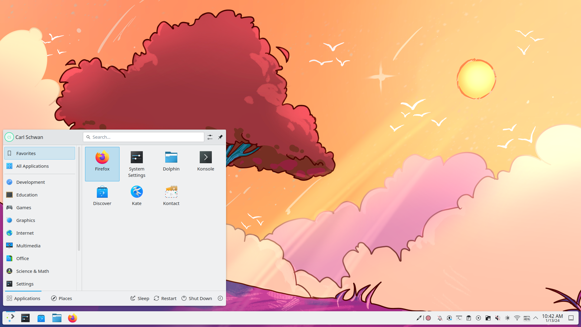
Today the KDE Community is announcing a new najor release of Plasma 6.0, and Gear 24.02. KDE Plasma is a modern, feature-rich desktop environment for Linux-based operating systems. Known for its sleek design, customizable interface, and extensive set of applications, it is also open source, devoid of ads, and makes protecting your privacy and personal data a priority.
With Plasma 6, the technology stack has undergone two major upgrades: a transition to the latest version of the application framework, Qt 6, and a migration to the modern Linux graphics platform, Wayland. They will continue providing support for the legacy X11 session for users who prefer to stick with it for now. The new version brings the new windows and desktop overview, improved colour management, a cleaner theme, more effects, better overall performance, and much more.


Wow. They just lifted the horrific Desktop management paradigm from MacOS.
But I don’t know, I guess people like it, and fortunately I’m not forced to use KDE.
What do you mean? Which desktop management paradigm?
I think he’s referring to Gnome, which kind of feels like MacOS?
I’m not sure what he means either, but if he meant gnome he’d have said Gnome, and probably posted it on a submission about Gnome.
And Gnome really doesn’t feel like MacOS at all. Beyond a black bar at the top with a few bits in it, they’re very, very different.
E: I think they’re referring to the new overview menu that’s essentially a clone of Gnome’s Activities view. But that’s not really how it is on MacOS either.
And I’m not sure why you immediately downvoted lol. Have I done something to upset you?
I didn’t downvote you lol
No, I’m referring to KDE. Check the link in the post and watch the videos. The desktop switching is now working almost exactly like in MacOS.
Of course KDE wins by allowing to configure it.
What exactly are you referring to?
Can always change whatever you don’t like, that’s the strong part of KDE, unlike Gnome where you have to rely on 3rd party extensions and hope they don’t break next update.
I’m amazed that people like this style of desktop switching. Linear? Why? It’s easier to picture my place “in a small grid” than in a “long line of desktops”. Since “forever” I’ve used a 3x3 grid of desktops that I navigate with
++. Turn off all of the stupid animations, effects, etc. and make it an instant desktop change. I assume KDE being KDE this will still be configurable as it is in Plasma 5 though.Yup it is configurable, There are many switchers to choose from
I think this just comes down to differences between people, 3x3 grid is far more confusing for me than finding my place in line. Instant desktop change is also super jarring, but if it works for you then keep on doing your thing.
The total opposite doesn’t really seem to have get the same attention either.
The one thing I really want to bring from gnome is the dynamic workspaces. I don’t have to think about where and how to group applications I just take up space as I need to.